Medical product design, AiirisDX
A better clinical workflow, from first frame to final report.
AiirisDX is a desktop SaaS product for gastroenterologists, bringing real-time AI-assisted endoscopy, patient records, exam history, and structured reporting into one connected workspace. Product design was led end to end by Roman Klimkin, part of the Uku Lab team.
Product design led by Roman Klimkin, Uku Lab.
Read Roman's original case study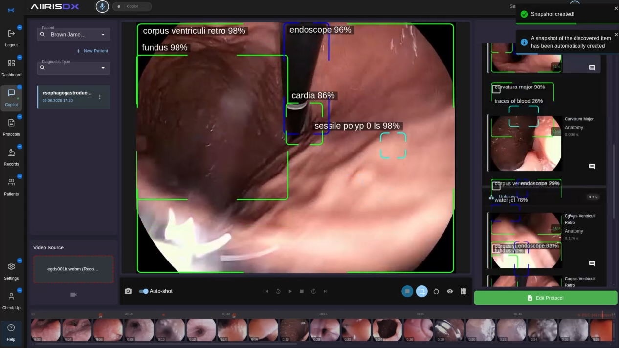
The overview
Design the complete system, not just the screen with the AI.
The early product concept centered on AI-assisted detection during endoscopic and colonoscopic examinations. The larger opportunity was a cohesive product where the video feed, findings, patient record, exam history, and reporting could support one another instead of creating extra handoffs.
Roman joined while AiirisDX was still a rough prototype and took ownership from early concepts and wireframes through research, workflow design, production UI, identity, marketing website, explainer materials, and investor presentation support. The work made the product story coherent wherever it needed to be understood.
Project facts
- Sector
- Medical AI and gastroenterology
- Product
- Desktop SaaS for examination and reporting
- Scope
- Research, UX, UI, identity, web, video, investor support
- Team role
- End-to-end product design by Roman Klimkin
The challenge
Fragmented clinical software creates friction before, during, and after the exam.
01
Disconnected workflows
Many tools separated the live examination from patient records, images, and reporting.
02
Missed context
Detection tools could flag an area but often stopped short of supporting review, evidence, and documentation in the same place.
03
Documentation load
The source study describes reporting as a major post-procedure burden, despite a much shorter examination itself.
04
Trust requirement
AI had to feel like a reliable second set of eyes, not a black box that displaced clinical judgement.
The product goal was to support an approval-ready MVP, streamline documentation, and make AI assistance useful without framing it as a clinical replacement.
Research and opportunity
Five practicing gastroenterologists shaped the product's priorities.
Interviews focused on where time disappears, how a clinician wants assistance to behave, and what would make a system immediately useful in the room. The outcome was a product direction that treats AI as a trusted assistant: visible when it helps, reviewable when it matters, and never in the way.
Insight 01
Technical barriers
Teams described dated data systems, disconnected video and reporting, and little automation around routine documentation.
Insight 02
Diagnostic quality
Subtle findings can be difficult to spot, particularly for less experienced clinicians, while familiar routines can create blind spots for any practitioner.
Insight 03
Workload
The procedure may be brief, but documentation and review can occupy a substantial part of the total workflow.
Insight 04
Collaboration
Practitioners needed easier ways to revisit the record, compare context, and support a second look when appropriate.
Insight 05
Training
The product had to strengthen clinical attention without presenting AI as a substitute for professional judgement.
The design position
Detection should guide attention, while the clinician stays responsible for the decision.
Pattern research
Borrow the right mechanics, not the wrong habits.
The work examined adjacent medical AI tools for the language of anomaly overlays and probability cues. It also looked to video editing software for timeline navigation, markers, and review patterns that make long visual material faster to revisit. The opportunity was a clinical environment that felt precise and familiar without inheriting the rigidity or clutter of existing systems.
Medical AI
Clear anomaly overlays and signals to direct attention during a live examination.
Video timelines
Markers, split-view review, and faster navigation through visual evidence and events.
Workflow design
Three paths that keep clinical context intact.
01
Start a new examination
Dashboard → patient lookup or creation → exam type → live or uploaded feed → assisted reporting
The setup flow brings patient selection, exam configuration, live analysis, snapshots, and report preparation into one controlled sequence. It removes the handoff between a procedure screen and a separate reporting tool.
02
Review patient history
Dashboard → patient list → search or filter → patient profile → exam history
A clinician can move from a quick search to the record without losing context. Demographics, notes, prior exams, responsible physicians, reports, and recordings remain connected for follow-up work.
03
Review or edit a report
Dashboard → recent exam logs → search or filter → report or recording → validate findings
A chronological record gives every review a clear starting point. Filters narrow the log, while linked reports and patient cards keep the evidence trail available for editing and audit.
From wireframes to a working system
A modular interface designed around the reality of clinical attention.
Roman moved the initial flows into wireframes, then refined each module through feedback and usability-focused iteration. The visual system balances a dark examination environment with clean reporting views, readable histories, and information-dense logs that can still be navigated quickly.
Module 01
Dashboard
The dashboard gives the system a quiet starting point. It prioritises quick access to a patient and the next task instead of treating the interface as another obstacle before a procedure.
Module 02
Live examination
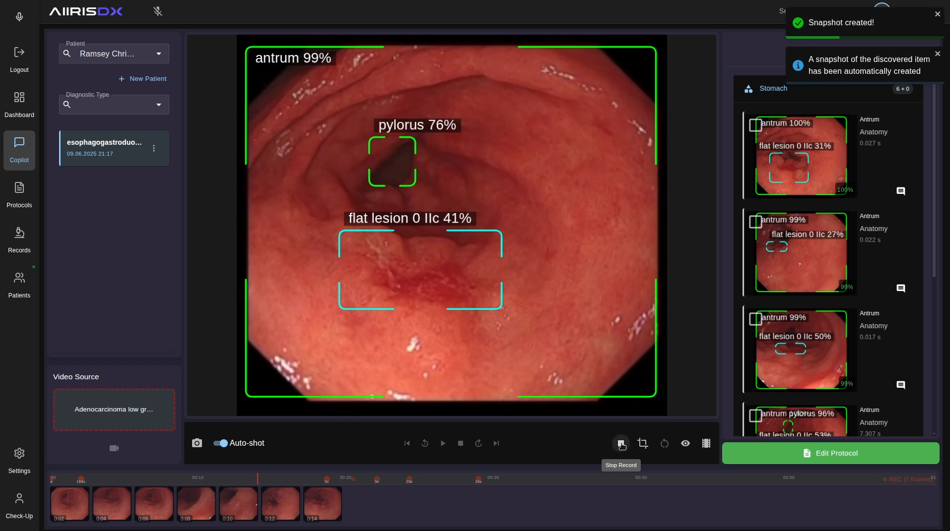
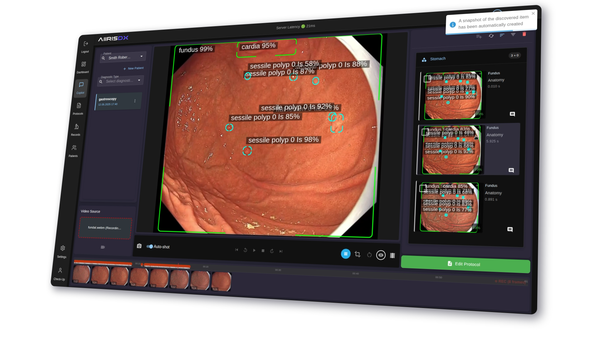
This is the critical moment in the product. A dark field reduces glare during sustained focus, while anomaly markers, snapshots, timeline events, and annotations remain available as secondary information.
Module 03
Report generator
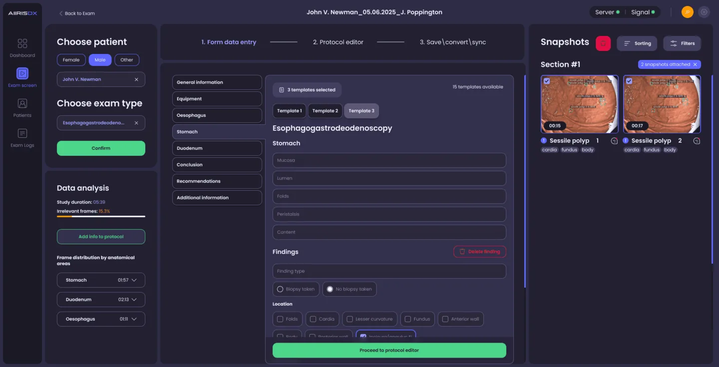
The reporting view translates findings into a structured document. Its purpose is not to remove clinical control, but to connect reviewed evidence, anatomy, and visual references so clinicians can validate and complete the record faster.
Module 04
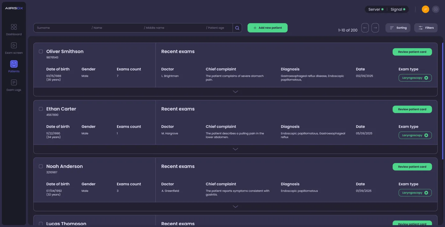
Patient history
Dense records need visual rhythm. Strong identifiers, aligned metadata, expandable detail, and breathing room make a long history navigable without hiding the clinical context.
Module 05
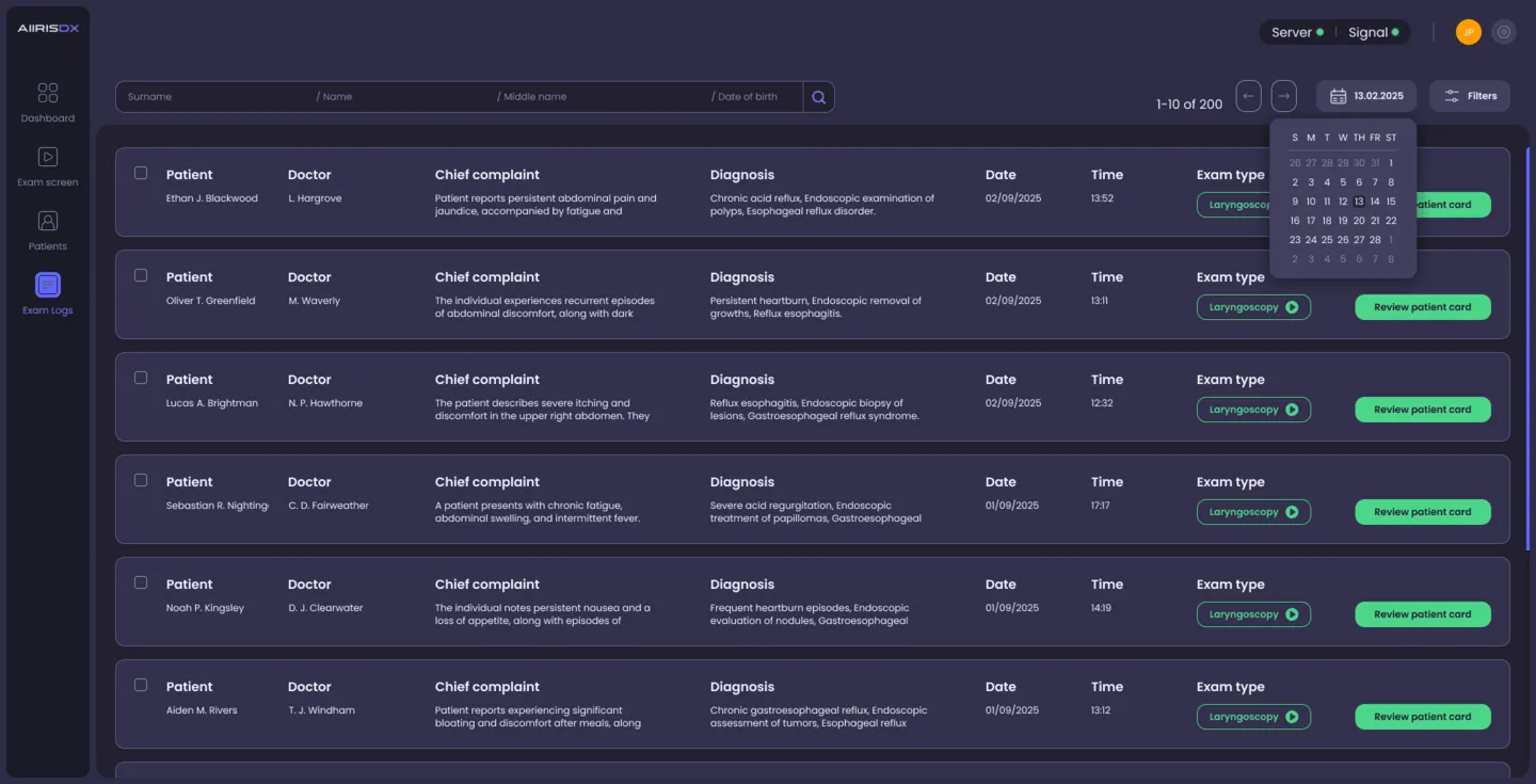
Exam logs
The archive was designed to feel light even when it contains hundreds of entries. Filters and grouped metadata make review efficient, while row density is balanced against readability.
Beyond the product
One identity and story across every launch touchpoint.

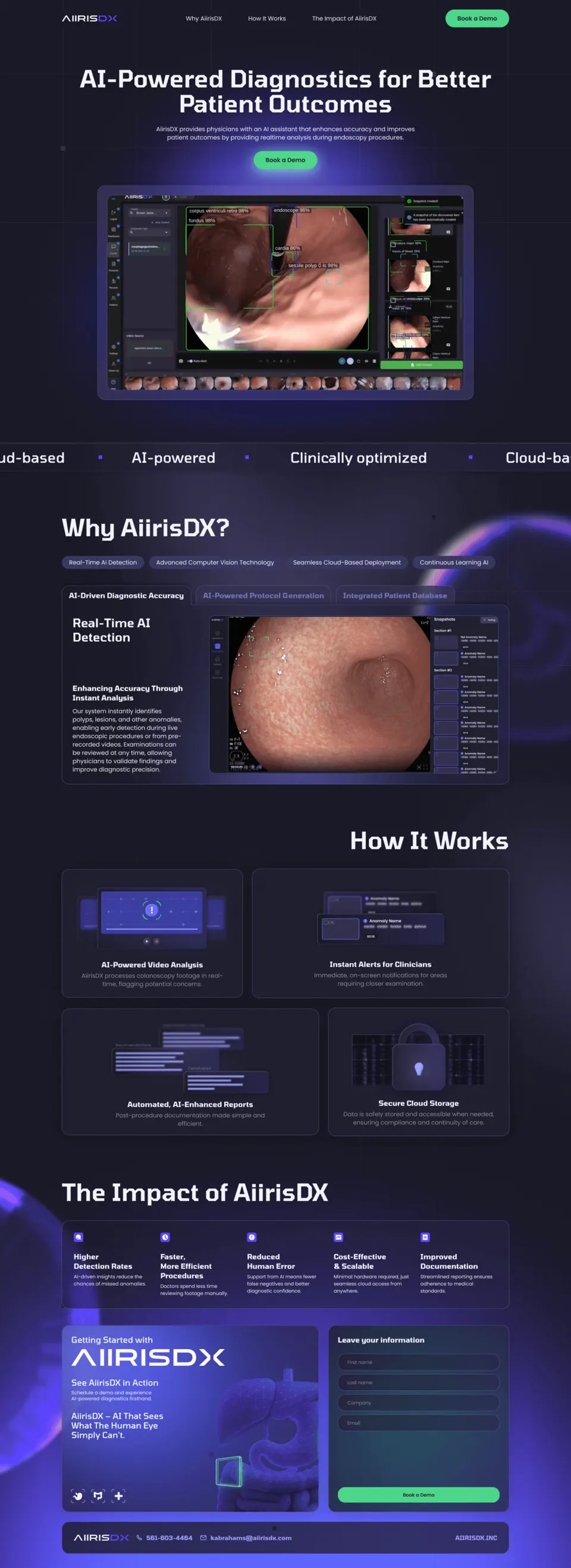
The work continued beyond the application. Roman created the brand identity, a concise landing page, a broader corporate website, explainer and teaser videos, and investor-facing presentation support. This made the product easier to recognise and easier to explain to clinical, partner, and investor audiences.
- Logo and visual identity
- Landing page and corporate website
- Explainer and teaser videos
- Investor presentation materials
Outcome
A product story with clinical workflow at its centre.
The engagement delivered a connected product direction from research and workflows to interface, identity, launch materials, and investor support. It gave AiirisDX a consistent way to explain how AI-assisted review fits into the real work of a gastroenterology team.
Reported project result
About 2 to 3 minutes for a report workflow previously reported at 15 to 20.
This workflow result is attributed to clinical testing described in Roman Klimkin's source case study. It is a project outcome, not an independent clinical claim.