Brand & Product, Firm Grip
Built for the Grip That Holds
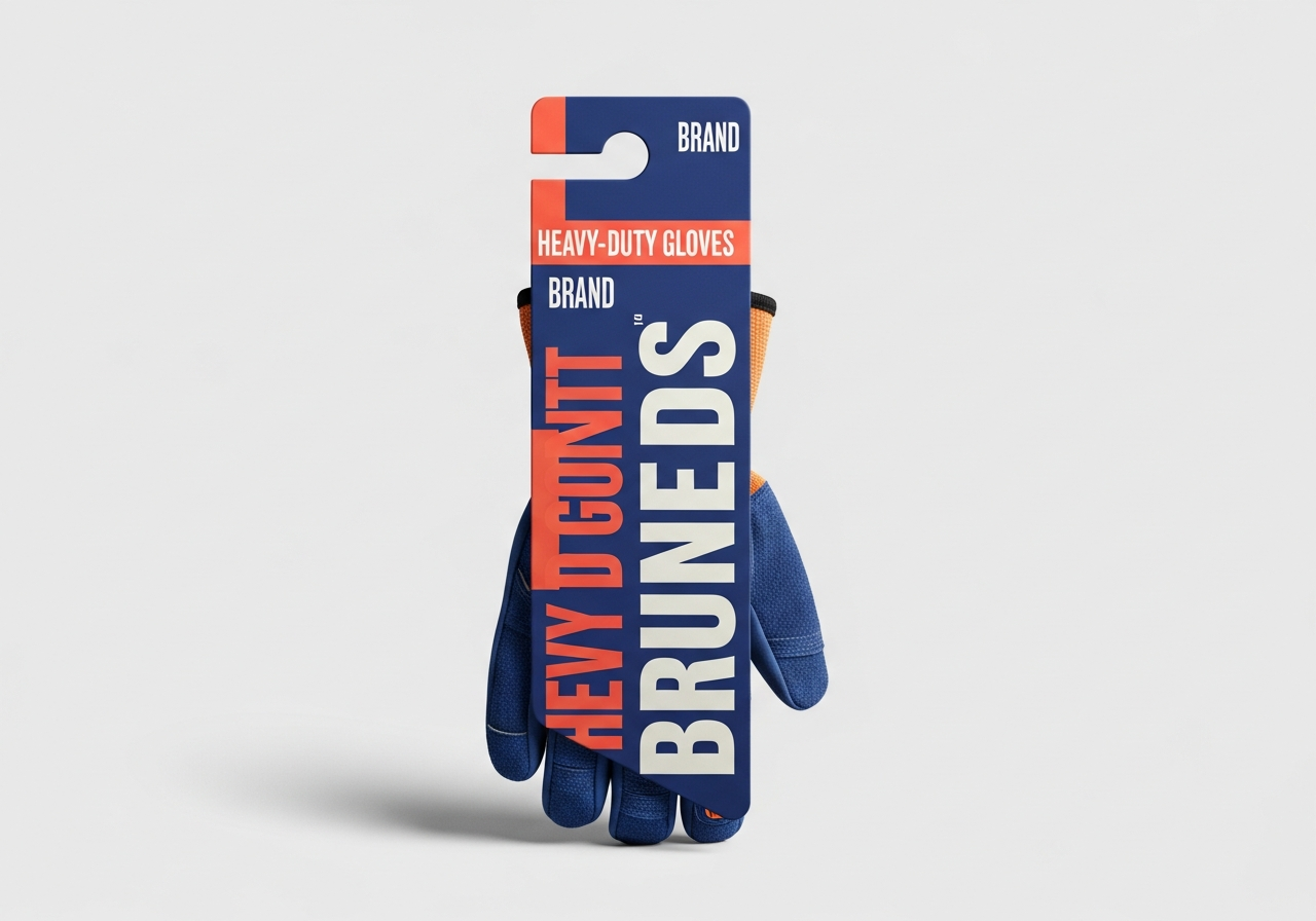
Firm Grip FX makes heavy-duty gloves and grip gear for people who work with their hands. We gave the brand a rugged, premium identity and a product-led campaign that earns trust before anyone reads a single spec.
The Brief
Work gloves live in a crowded, commoditized aisle where most packaging shouts specs and forgets the person buying them. Firm Grip FX needed to feel tougher and more credible than the wall of competitors around it.
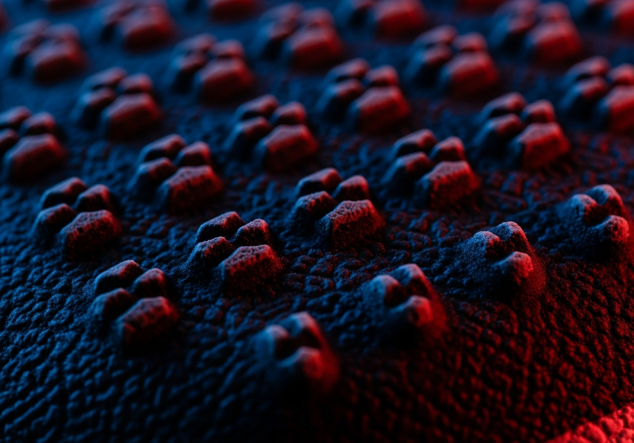
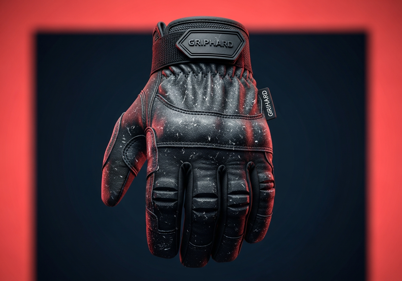
We built an identity with grit and weight: deep shadow, a sharp accent, and product photography that treats the glove like serious gear rather than a throwaway commodity. The texture and detail do the talking, so the quality reads instantly.
The same system runs from packaging to campaign, pairing close-up material detail with real moments of effort, so the brand proves its durability instead of just claiming it.
What We Did
- Brand identity
- Packaging design
- Product art direction
- Campaign photography direction
- Messaging & copy
The Approach
01
Toughness you can see
Gritty texture, hard light, and deep shadow make the gear look as durable as it is, so credibility lands before a single feature is read.
02
Detail that sells the spec
Macro shots of the grip surface turn material quality into the hero, letting the product prove its value instead of relying on a list of claims.
03
One identity, shelf to street
Packaging and campaign share the same rugged language, so the brand feels consistent and trustworthy wherever a buyer runs into it.
The Work