Watch on TikTok
TikTok
Yebo! Goods: A little piece of South Africa
The Yebo! Goods identity, inspired by Zulu culture and built to make a South African food brand unforgettable.
Brand & Packaging, Yebo Goods
Yebo Goods makes South African staples for the US market, including biltong-style jerky and traditional meat pies, all handmade. The food carried real heritage. There was no brand to carry it.
Identity and packaging built from a single Zulu word.
One hand-lettered mark, one mask-pattern system, two sub-brand lines.
Social Cut
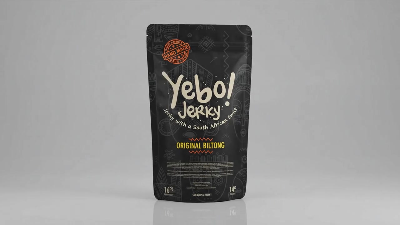
The brand story in a short-form cut made for the scroll, from the name and colours to the masks that carry the identity.
Yebo Goods was bringing South African recipes, including biltong-style jerky and traditional meat pies, to American shelves. The recipes were the real thing. The brand was a blank page. Nothing on the shelf told you where these recipes came from, who made them, or why they were worth choosing over something more familiar.
The brief was not just to design packaging. It was to build an identity that could carry the whole story: South African heritage, handmade quality, and a warm sense of welcome, without resorting to tokenism or tourist-shop clichés. The name “Yebo” gave us the starting point.
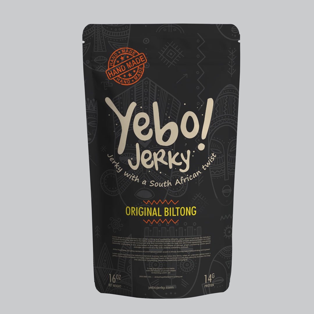
“Yebo” means “yes” in Zulu. We made it the heart of the identity: a hand-lettered wordmark full of warmth and energy, paired with a custom ceremonial-mask illustration that became the brand's signature texture. From that foundation, a system that stretches across a dark premium jerky pouch and a warm kraft pie box. One brand, two products, one unmistakable voice.
South African food is almost unknown on US shelves. Biltong is not jerky. Meat pies are not pot pies. Introducing unfamiliar products to a new market usually goes one of two ways: a brand either over-explains in a way that feels apologetic, or leans into visual shorthand that reduces a culture to decoration. Neither approach was acceptable.
01
Biltong is dried, cured beef, similar to jerky but not the same. Meat pies are a staple of South African home cooking. Neither has mainstream US recognition, so the packaging had to create context without being a history lesson.
02
South African visual culture is rich. It is also frequently reduced to a handful of symbols whenever a brand wants to signal "Africa." The challenge was to draw on something genuinely rooted in South African craft, specifically ceremonial mask tradition, and use it with specificity.
03
A premium dark jerky pouch and a warm kraft pie box serve different shelf contexts, different price points, and different purchase moments. A packaging system that forces both products into the same format would have made one of them wrong.
The answer was not to explain South Africa. It was to build a brand that behaved like it came from there, in its name, its letterforms, its illustrated patterns, and the materials it chose.
01
"Yebo" is Zulu for "yes." We made it the heart of the identity, a hand-lettered wordmark full of warmth and energy that greets customers in the language of the food's home. The name is the brand.
02
A custom illustration of ceremonial masks became the brand's signature texture. It signals South African heritage instantly without leaning on cliché, and ties every product in the range together into one recognisable family.
03
The visual language flexes from dark, premium biltong pouches to honest kraft pie boxes. Each sub-brand reads as its own thing, its own product and its own moment, while staying unmistakably Yebo.
The Yebo! wordmark is drawn by hand, not set from a typeface. Hand lettering carries a warmth and individuality that no font can replicate at the same weight. It tells you something was made by a person, not assembled by a machine. The exclamation mark is part of the name: an invitation, a greeting, a small piece of energy that sits on every product.
Every piece of packaging is designed to work on the shelf as an individual product and as part of the Yebo family. The mask pattern and the wordmark are the connective tissue; material, colour ground, and finish are how each sub-brand makes its own statement.
Biltong & Jerky
Biltong is traditionally a premium snack in South Africa. The pouch reflects that: a dark ground, the mask pattern as a full-bleed texture, and the hand-lettered Yebo! wordmark as the hero of the front panel. It reads confident on the shelf without a word of explanation.
Meat Pies
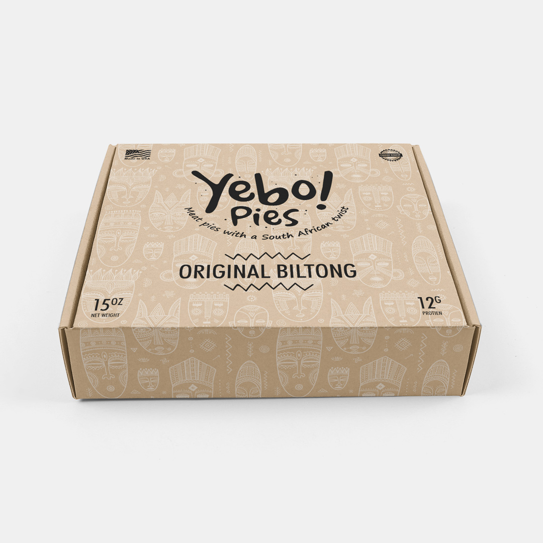
South African meat pies are honest, handmade food. The box reflects that with uncoated kraft, a warm, tactile material that signals handcraft without pretending to be something more refined. The mask pattern runs full-bleed, anchoring the flavour range to the same visual identity.
The full range
A packaging system succeeds when every SKU is immediately recognisable as its own but unmistakably part of the family. Colour coding on the pie boxes separates Thai Chicken from Chicken & Mushroom from Pepper Steak, while the mask pattern and wordmark hold the range together.
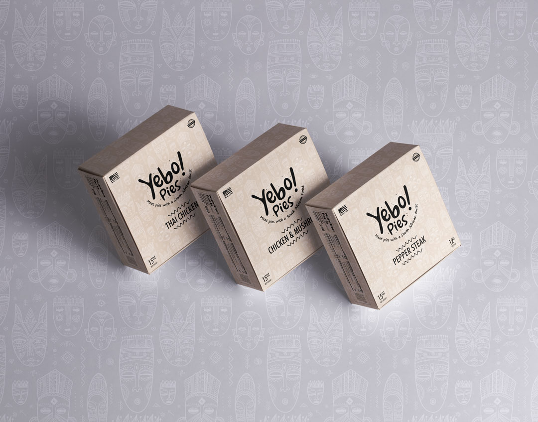
In context
Packaging design that only works in isolation is not a system. This in-context view shows the flavour range set against the mask-pattern texture, demonstrating how individual products remain distinct while reinforcing the same brand environment.
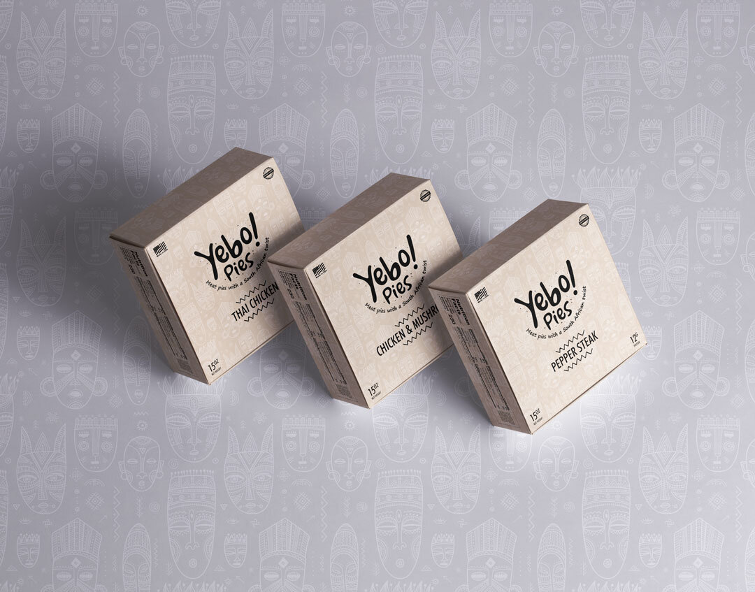
The engagement covered the full brand foundation: naming direction and strategy, a hand-lettered identity system, a custom ceremonial-mask illustration developed as a repeating pattern, and packaging design for two product lines across multiple flavours. The system is built to extend to new SKUs, new products, and new retail formats without losing the character that makes it distinctly Yebo.