Brand & Campaign, Scott
An Everyday Staple, Made Iconic
Scott is a name people already trust in their kitchens. The challenge was not awareness, it was attention. We built a campaign system that gives a familiar paper product real presence on the shelf and in the feed.
The Brief
Paper towels are the definition of a low-interest purchase. Most shoppers grab whatever is nearest and cheapest, so the category rewards brands that can break the autopilot and earn a deliberate choice.
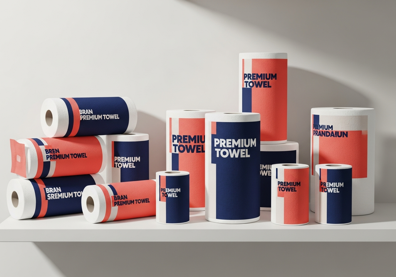
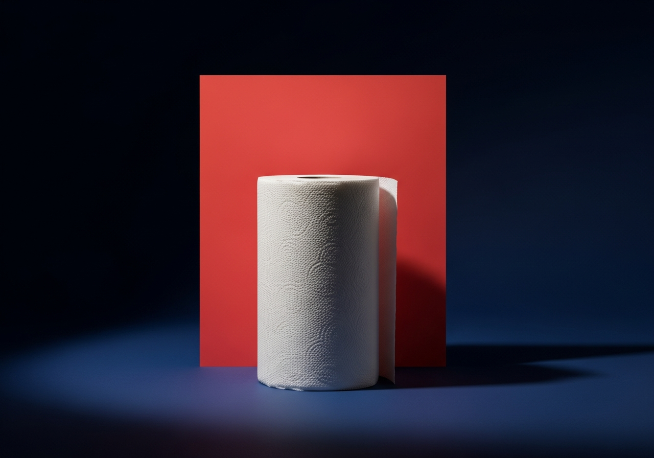
We gave Scott a bold, confident visual language built on clean negative space, a single strong accent, and product photography that treats an everyday roll like a hero object. The look is premium without losing the approachable, dependable feeling the brand is known for.
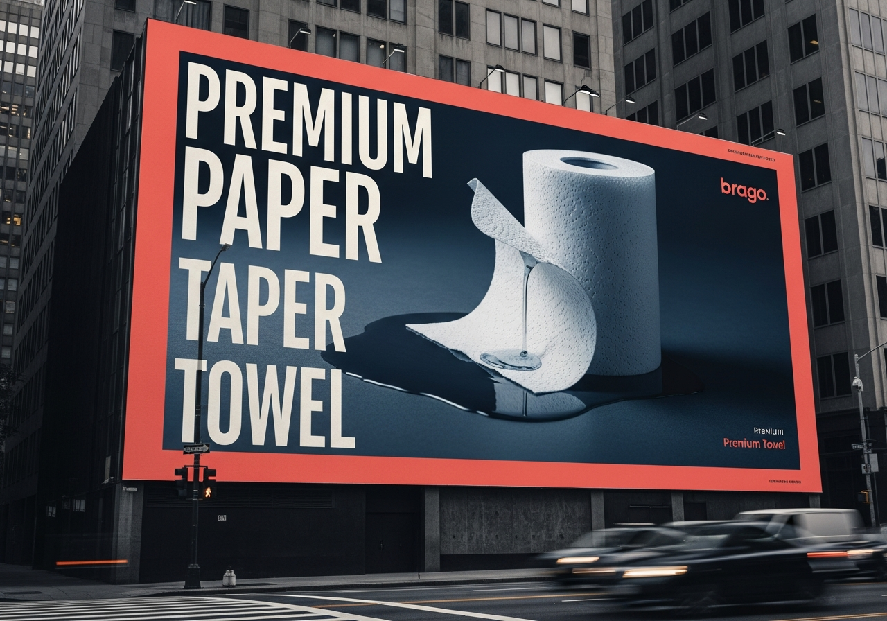
That system stretches across packaging, out of home, and social, so the brand shows up the same way whether someone meets it on a billboard, a shelf, or a phone screen.
What We Did
- Campaign concept & art direction
- Packaging refresh
- Out of home design
- Social campaign system
- Messaging & copy
The Approach
01
Attention, not just awareness
Everyone knows the brand, so we did not sell the name. We built visuals striking enough to interrupt a routine purchase and make people actually look.
02
Premium, but still approachable
Clean space and hero product shots lift the brand upmarket, while a warm accent and honest tone keep it feeling like the dependable staple people already love.
03
One system, every surface
Packaging, billboards, and social all share a single visual logic, so the brand reads as one confident idea no matter where it shows up.
The Work